Project Overview
Team: Myself as UX Designer, Principle Product Manager, Sr. Program Manager
Duration: 8 months
Tools: Figma
Deliverable: Interactive prototype for redesigned tool
My Role: User research, ideation, user flows, wireframing, visual design, prototyping, product strategy
Medaan is tool for Classifiers, workers that are assigned a batch of products to investigate details by reviewing their attributes within the Amazon database and cross-referencing them with external sites to determine the correct classification for them within the Amazon catalog to adhere with regulatory compliance standards.
User Problems
Disorienting UI that leads to user confusion and input errors
Inefficient use of screen real estate, slows down reviewing work items
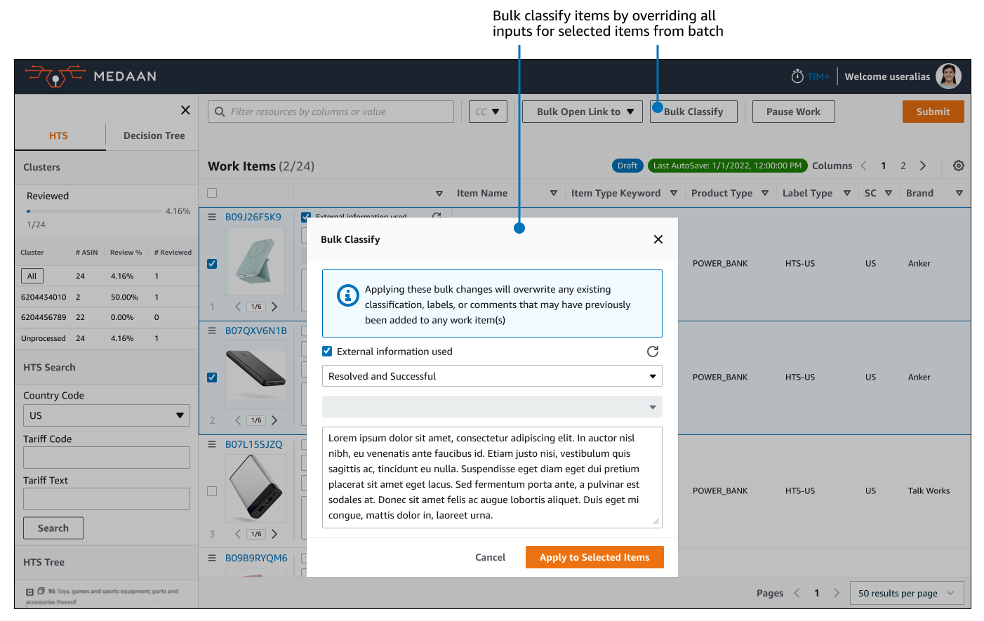
Lack of organized way to classify items in bulk
Reliance on finding and opening external resources one by one
Business Problems
User errors while reviewing items risks incorrect classification of products into their appropriate compliance standards
Inefficient user practices in utilizing research tools lead to lower productivity rate and products not being classified on time for listing on marketplace
Objective
My responsibility was to lead the UX redesign and convert Medaan into a single centralized tool that incorporated the overlapping functionalities of 2 other existing work execution systems.
The tool need to utilize an internal design library and improve how classifiers conducted product research from both external and internal resources, address user pain points, and reduce cognitive load to enable faster and more accurate classification decisions to improve compliance and safety in product offers for Amazon consumers.
User Painpoints

Inefficient use of screen real estate & disorienting navigation
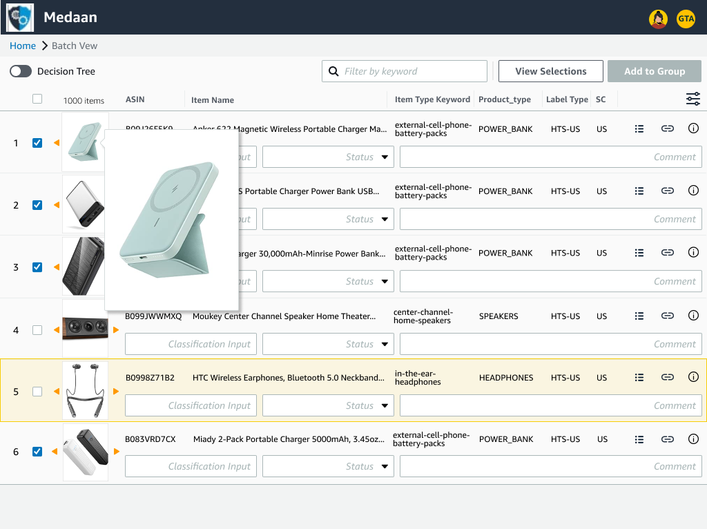
A single product in the batch list of items (highlighted in the image) took up too much screen space and did not display enough information at once.
Classifiers were required to both horizontal and vertical scroll to scan each product attribute column.
As Classifiers were working remotely, users using a mouse had ergonomic difficulties being able to navigate the table comfortably.
Since they had to scan for details quickly in a batch of what could be hundreds of items, scrolling around the table in all directions led to confusion of what attributes pertained to which item.

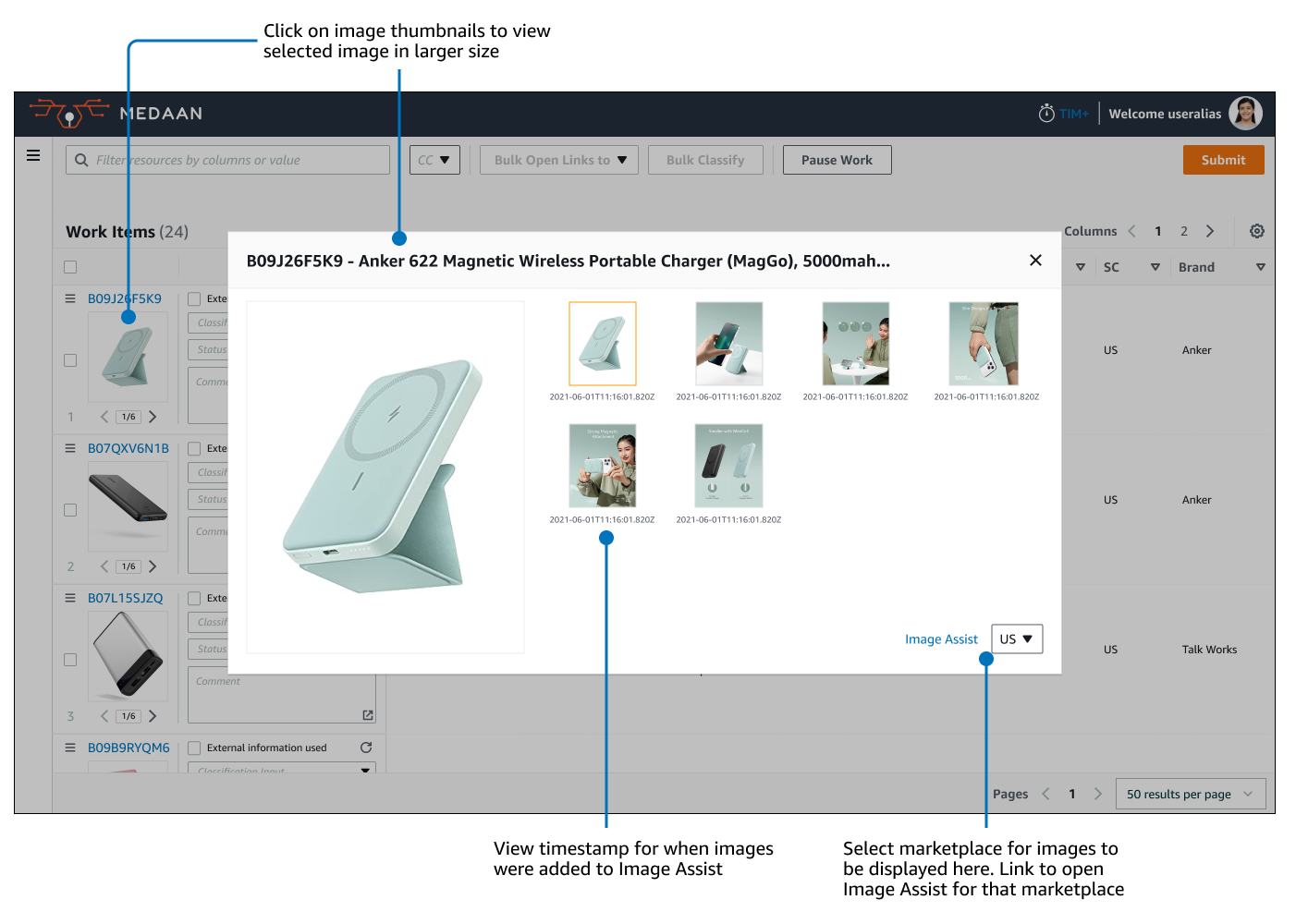
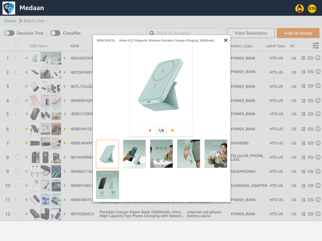
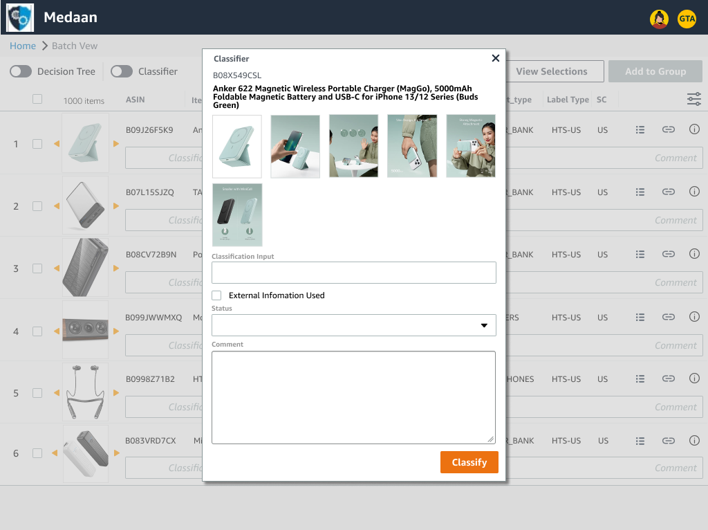
No method to directly examine product images
Reviewing the product images to closely look at details as material composition is a crucial part of the Classifier workflow.
Only small thumbnails were viewable within the tool. Classifiers had to rely on using a separate tool to look at larger images for each product negatively impacting productivity rates.

Redundant or ambiguous toolbar controls that only set temporarily
The UI had buttons and toggles that did not work as expected or were unclearly labeled causing Classifiers to make unintended changes.
When Classifiers paused a session to take breaks or end their shift, upon resuming they were required to take time to set filters again negatively affecting productivity rate.
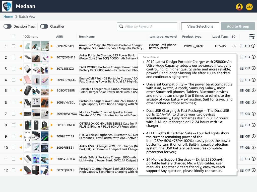
Common research resources scattered across many tabs
Classifiers needed to reference information from an abundance of product pages from both external and internal sites. For each item, there would be a multiple tabs that had to be opened in order to properly research the item.
Juggling where data was coming from other sites and which corresponding products they belonged to resulted in a high cognitive load. This resulted in Classifiers making errors due to mixing up information and where to correctly input them.
Finding internal data on product required opening a separate tool
Even with researching data from internal company resources, there were other tools that Classifiers needed to utilize to uncover the full details about an item. While related, the tools did not communicate with each other or share information.
This slowed down production rate as Classifiers had to navigate to the other tool for each item. Navigating between multiple tools also led to them interpreting information from one item to the incorrect corresponding item.
Lacking user configurable organization settings
Product attribute columns in the table could be added but could not be reordered or removed.
This lead to Classifiers sometimes having an abundance of additional unnecessary columns and/or having to navigate further between different points on the table to view data they were seeking.
Research & Process
Preliminary User Interviews
I lead during user focus groups and tracked trends in what participants repeatedly expressed as their frustrations during conversation, converted those into user stories, and focused on what features could be implemented to best address them.
User Stories
As I user, I want…
to navigate the batch list of products with more ease
to avoid being confused about where I copied information on the table relative to the product that it belongs
to be able to customize, reorder, and remove product attribute columns
to have the table columns and filters I’ve set be saved when I take breaks
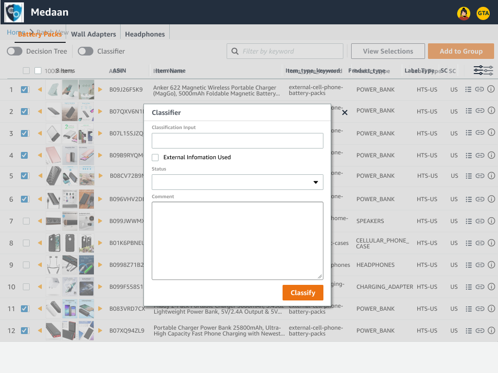
to classify items with common parameters in bulk in an organized manner
to be reduce the number of tabs I have open for research
to be able to open external research pages for more than one product at a time
to be able to view internal research information in a consolidated place
to be able to zoom in on product images within the tool itself
Design Iteration
High Level User Flow Diagram

Process overview of acquiring new work items and pain points that needed to be addressed in classifying items in bulk and researching individual items for more details
Wireframes


Taking into account pain points from the Classifiers, I created the initial wireframes to focus on a layout structured around:
a more compact list of items
adding method zoom in on photos for closer examination
grouping items to submit classifications in bulk
adding way to show input actions on screen regardless of where user is on the list
1st Iteration (Mid-Fidelity)


In the 1st iteration, I wanted to test how much content on display would be useful for Classifiers to help boost workflow efficiency by:
packing in a large number of items in a more compact list to allow more items to be scannable at once
fitting in more thumbnails on screen at a smaller scale to see more details about an item at a glance while adding mouse-over hover image previews to quickly see more detail when needed
adding ability to click on images and to show all of them in a larger view without needing to refer to a different tool
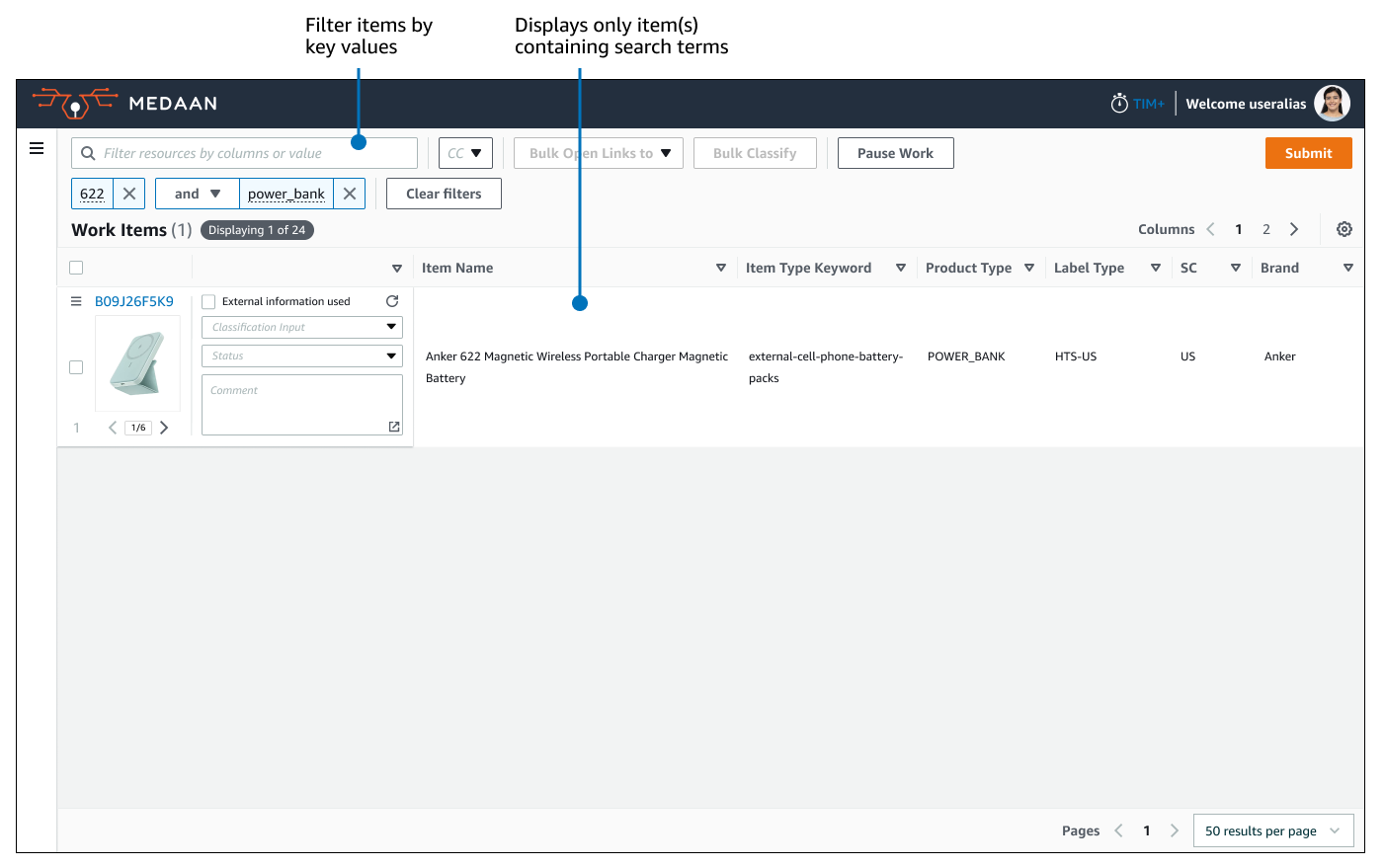
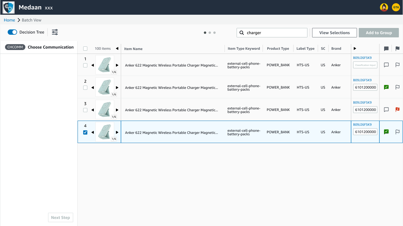
live filtering of items by keyword search to display only items that contain that keyword allowing selections to be made from a smaller pool
changing parts that utilized large amounts of screen space like product info bullet points, resource links, and input fields into icons that would only display them when clicked
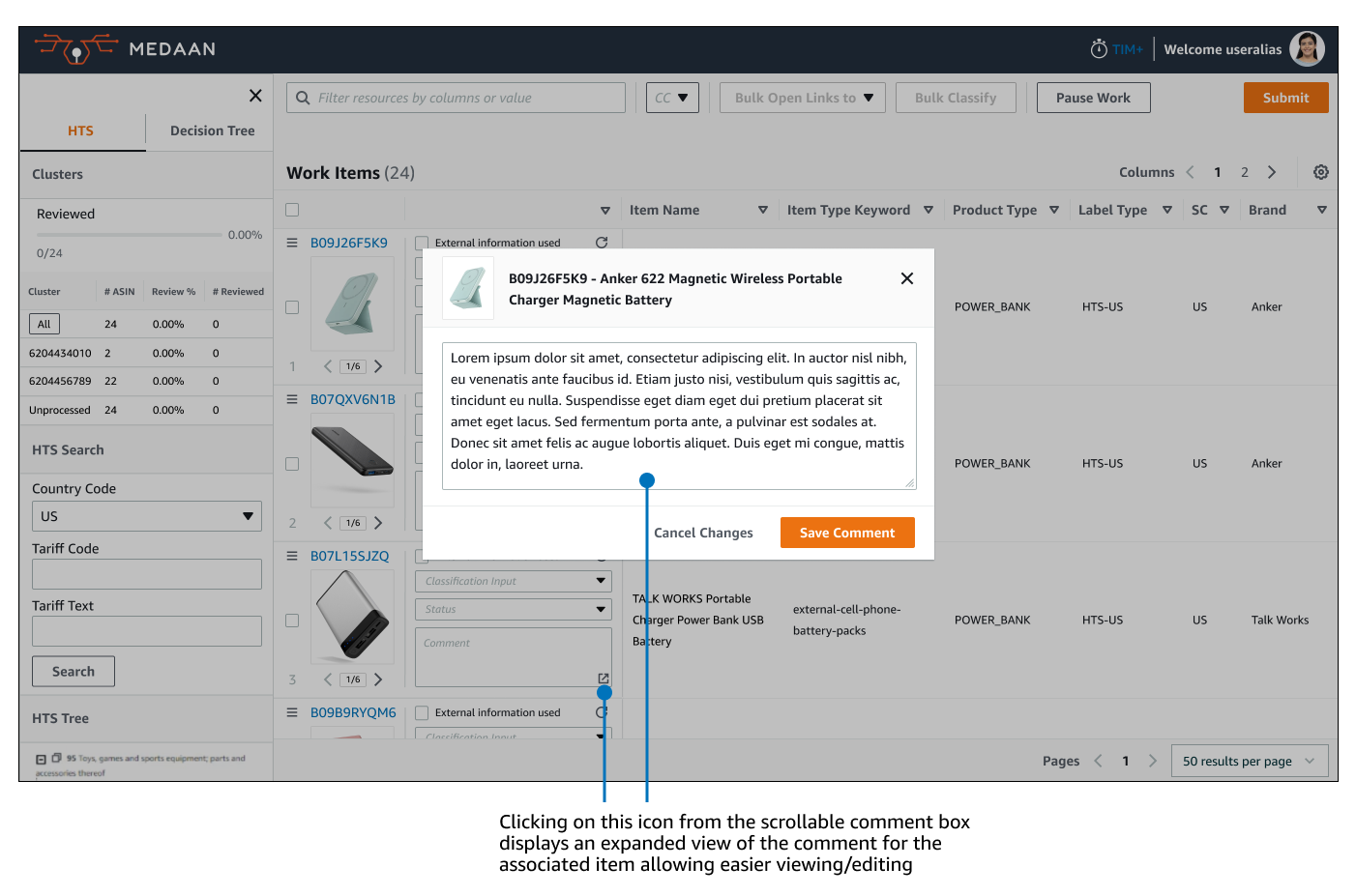
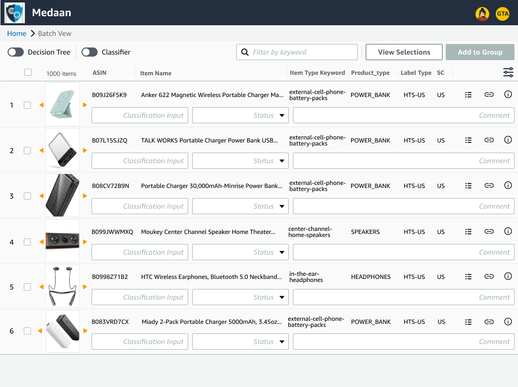
added dedicated window for classification input fields providing more space for viewing/inputting text
2nd Iteration (Mid-Fidelity)
For the 2nd iteration, I took into account feedback from demoing walkthroughs of the initial mocks and doing user interviews with Classifiers and program leads and made the following updates:
reduced the number of items on display and adding more spacing to reduce visual clutter. Users indicated that while being able to view more items on screen was significantly more useful than what they were using before, the amount of information could be overwhelming.
reverting back to a single thumbnail per item. Users felt that a larger thumbnail is more useful than having multiple small ones and that the previous addition of a larger image view was enough.
adding classification input fields back into each item row again in a more space efficient manner to allow direct inputs
added product images into dedicated classification window for easier item differentiation
3rd Iteration (Mid-Fidelity)
For the 3rd iteration, I made further updates based on user interviews, project walkthroughs, and began focusing on other major pain points by:
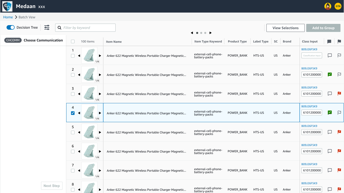
introducing column pages and frozen panes for product thumbnails and classification inputs. These changes addressed one of the major challenges of allowing users to navigate the list of items each containing any amount of user configurable columns without necessitating the need to horizontally scroll
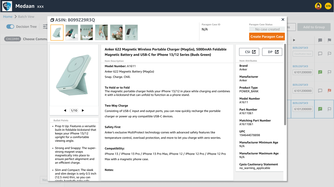
adding Single Item View for a detailed product information on individual products. Single Item View aggregated details sourced from all the common internal research resources and displayed them in one location to boost productivity and reduce research errors from previously pulling information from different sources
changing classification input fields back into icons that would change if they were filled out with the purpose of utilizing less screen real estate. This was to test if this was sufficient enough glanceable information as users indicated that they primarily needed to see that content was filled out in their workflow
Solutions & The Redesign
Final Iteration (High-Fidelity)